Selecting the right frame is one of those decisions that can quietly elevate your artwork—or unintentionally hold it back. A well-chosen frame doesn’t just “finish” a piece; it enhances its presence, protects it, and helps it feel at home in your space. Whether you’re displaying a painting, photograph, or print, the frame plays a subtle but powerful role in how your art is experienced.
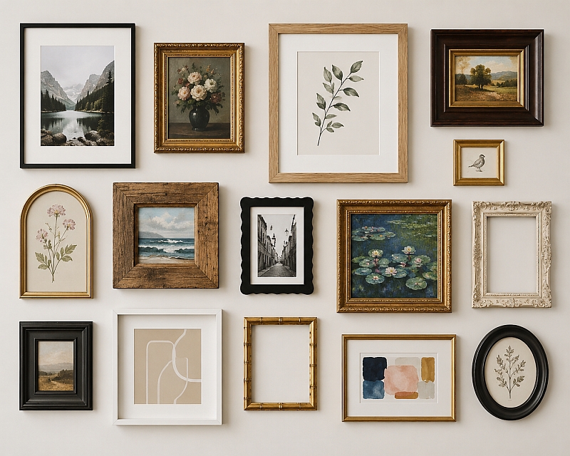
Match the Frame to the Artwork Style

The style of your artwork should guide your frame choice. A traditional oil painting often pairs beautifully with an ornate or gilded frame, while a sleek, modern print may benefit from a clean-lined black or white frame.
Try to think of the frame as an extension of the artwork’s voice:
- Classic art: Ornate, carved wood or gold finishes
- Modern or abstract: Simple, minimal frames
- Nature or landscapes: Rustic or natural wood tones
- Photography: Neutral, understated frames
If the frame draws more attention than the art itself, it’s probably the wrong choice.
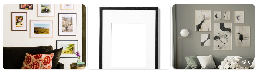
Consider Colour and Contrast
Color can make or break the relationship between the frame and the artwork. You can either:
- Complement the colors in your piece for a harmonious look
- Contrast them to create visual interest and definition
Neutral frames—like black, white, or natural wood—are versatile and tend to work with most pieces. If your artwork is bold and colorful, a subtle frame often works best. Conversely, a more subdued piece can benefit from a frame with a bit more personality.
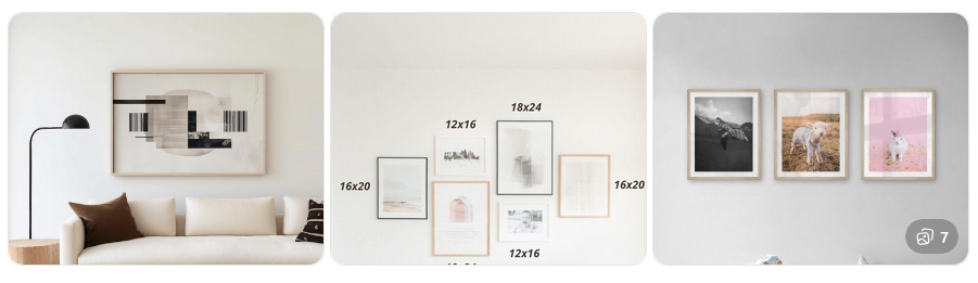
Get the Proportions Right
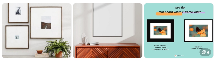
Scale matters more than people expect. A frame that’s too thin can feel underwhelming, while one that’s too thick might overpower the piece.
A few general tips:
- Larger artworks can handle thicker, more substantial frames
- Smaller works often look better with thinner frames or added matting
- Mats (the border between art and frame) can give smaller pieces breathing room and a more professional look
Think balance—your frame should support the artwork, not compete with it.
Think About Your Space
Your frame should also relate to the room where the art will live. Consider your décor style:
- Modern interiors: Sleek, simple frames
- Traditional spaces: Rich woods or ornate details
- Eclectic rooms: Mix and match styles for a curated feel
If you’re building a gallery wall, consistency in frame color or material can help unify different artworks.
Don’t Forget Protection
Beyond aesthetics, frames serve a practical purpose. Look for:
- UV-protective glass or acrylic to prevent fading
- Acid-free mats and backing to preserve the artwork over time
- Sturdy construction to keep everything secure
This is especially important for original art or sentimental pieces.
Final Thoughts
Choosing a frame is part art, part instinct. While guidelines help, your personal taste matters just as much. Step back, look at the piece in its environment, and trust your eye. When it feels right, it usually is.
A thoughtful frame doesn’t just surround your artwork—it completes it.